
Illustration Tips
Thank you for your interest!
How to Create an Illustration
The following topics will cover the basic building blocks (procedure) that I use whenever I create an illustration. Below are the five areas that will be covered:
1. Format/Purpose
2. Concept/Idea
3. Composition/Finished Sketch
4. Reference
5. Completion
FORMAT/ PURPOSE
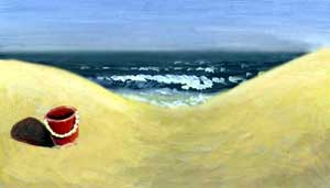
Let’s say you want to do a painting. One of the first things you’ll need to ask yourself is this: What Format and Purpose is this for? For example, suppose you have a neighbor who wants to pay you a large sum of money to create a painting of a summer beach scene. The format or the purpose of the painting is to hang on the wall in someone’s house. For the purposes of this exersise, we will call this painting Red Bucket on the Beach (final image at bottom of page).
But, lets say he also wants the painting it to hang above his couch. So, the next thing that you’ll need to decide is what the proportion or size the painting will be. Does he want a miniature painting or something that covers the entire wall? Should the painting be horizontal or vertical?
Then, you’ll need to decide what media would be best for your image. Will it be color or black and white? Do you use watercolor, acrylics, oils, pastels, etc.
CONCEPT/ IDEA
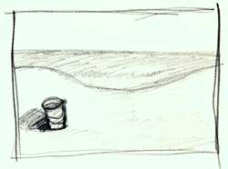 What is your idea? In this case, it’s a beach scene by the ocean with a bucket. Sketch out your idea by using thumbnail sketches. These are small, quick drawings to get your ideas down on paper. You can have as many as fifty thumbnails before you choose the best composition.
COMPOSITION
Composition is the arrangement of objects on a picture plane in a harmonious way that pleases the eye of the viewer. The five areas of composition are:
a) Positive Space
b) Negative Space
c) The Golden Section
d) Focal Points and Accents
e) Color
Positive Space is the main object/subject in the composition. Where you place this object on the picture affects and determines what to do with the negative space. For example, the red bucket in this picture is the object or positive space.
Negative Space is the space surrounding the object. Negative space can be utilized to bring focus to your object by using color and contrast. The negative space in the Red Bucket on the Beach is the sand and water that surrounds the bucket.
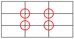 The Golden Section is a technique created by the ancient Greeks. You divide your picture plane into thirds vertically and horizontally, very much like the game of tic-tac-toe. Where the lines intersect is where your potential areas of interest are (see the areas inside the red circles below). Then, pick the best one. By using the golden section, I placed the red bucket on the lower left of the picture plane.
Focal Points and Accents are used to direct and attract the eye by creating conditions of contrast. That is, that they may be smaller, bigger, lighter or darker than the other compositional elements. This is where you can make good use of your negative space. For the Red Bucket on the Beach, I used the shadow of the bucket to point to the main object in the picture plane.
Color is the final element that can be used in your composition. For example; Warm, dark value colors come forward, such as red, yellow, orange, etc. Cool, light colors on the other hand recede or fade, such as green, blue, violet, black, white, etc. (note: value is the lightness and darkness of a color)
Everything gets warmer, brighter and more detailed as it gets closer.
Everything gets cooler and less defined as it moves away.
In the Red Bucket on the Beach, I used all primary colors; red, yellow and blue. I put the darkest and lightest values (white handle on the bucket and dark shadow on the sand) in and around the bucket. The red bucket is the most important area in my composition.
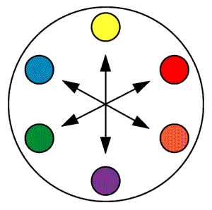 To make a color stand out, place it next to it’s opposite on the color wheel. For example: Violet is the opposite of Yellow. Orange is the opposite of Blue, and Green is the opposite of Red.
The next thing that needs to be done for our Red Bucket on the Beach is to produce a finished sketch in black and white. It is also good idea to create a quick color study to see how it would look before you made your final painting. Now is the time to work out any problems with your composition using the techniques stated above.
REFERENCE
You will need some reference material to create the finished work of art. What examples do you have of a beach, the ocean or a red bucket? For reference you could go to the library, or you could create your own morgue filing system. A morgue file is an organized way to gather and keep photos, clippings, etc. on hand for reference. I keep a metal filing cabinet just for that purpose. Inside of my cabinet drawers are manila folders organized into different sections or areas of interest. Inside each folder are photos, slides, sketches or magazine clippings for every section. I have several main sections, divided into many subsections. Some examples of the main sections that you could have are; housing, nature, animals, sports, transportation, people, costume, entertainment, art & science, industry, foreign, and misc. You can divide this even further by taking the main subject of nature, for example, and making folders for garden & flowers, trees, snow & water, and misc. Inside the folder gardens and flowers, you could put images of flowers, plants, vines, gardens, garden fixtures, and garden tools. Keeping a reference file like this is a real time saver. save those magazines!
COMPLETION
 Now you are ready to finish your painting. Take your final sketch, enlarge it, and transfer it to your paper, canvas, or board. When that is done, finish it with your chosen media. Red Bucket on the Beach was done in acrylic paints.